Overview
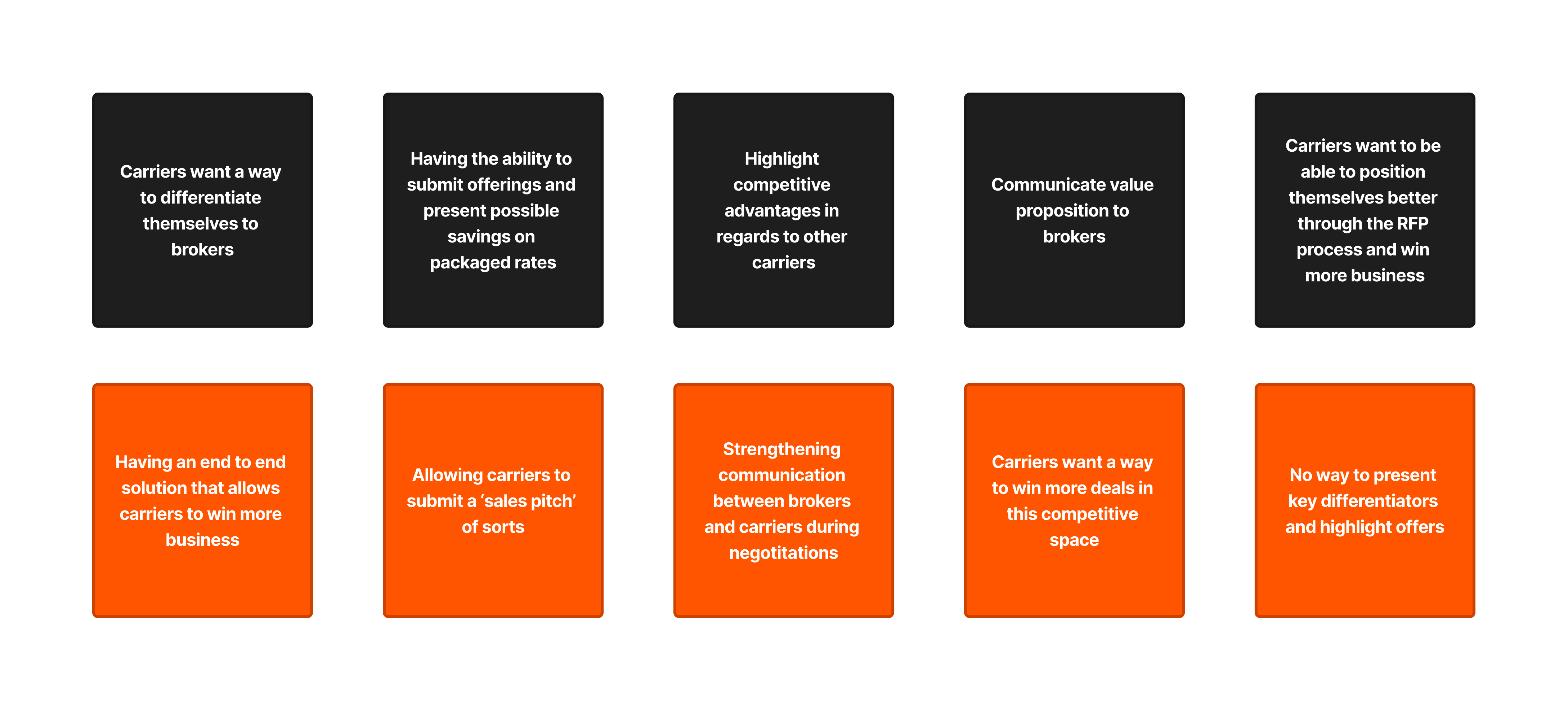
The purpose of this feature was to give our carrier clients a way to
differentiate themselves
and highlight their offerings. This was a process that was usually done through
email but in
order to improve the utilization of our platform, we wanted to create a feature
that would allow
carriers to do this in-app.
The development of this feature was guided by user feedback from the very
beginning. This helped
us collect requirements and gauge the scope of the project. The primary
requirement was giving
carriers a better and simpler way to highlight themselves as a business without
having to jump
between our application and email. The task was pretty straightforward but the
complexity
stemmed from what carrier users wanted to get out of this new feature. How
robust did they want
it to be? How many steps is too many? And how did they want to both input their
highlights and
how did they want brokers to view said highlights. There was a clear vision on
what we wanted to
and needed to achieve but much of our solutions came from actually sitting down
with our users.
This helped us answer questions and better define how we wanted this feature to
look and behave.
My Responsibilities
I was put in charge of the entire design portion of this project. From the early research stages where we were gathering user feedback all the way to handing off the final design to the engineering team. I was also tasked with creating various documentation such as opportunity statements, solution breakdowns, and initial design specs. This was done in close collaboration with the product management team. Apart from the research aspect of this project I was in charge of all of the interface design as well such as low-fidelity mockups, high-fidelity mockups, and fully functioning prototypes. And finally I led the user testing stages of the project that allowed us to test the feature before it went into development.

Requirements
There were various requirements that came with this project but one of the
primary ones was the
fact that we wanted a simple version of this feature for our MVP goal. Our
product team
basically stated that we needed to get something out of the door that got the
job done and that
we would add all of the bells and whistles later on. With this it was also
integral that we
remained within the set scope of the project on both the design team and
engineering team. This
was due to the fact that we had a stringent timeline on this feature and it was
also viewed as
an important release for us as an organization.
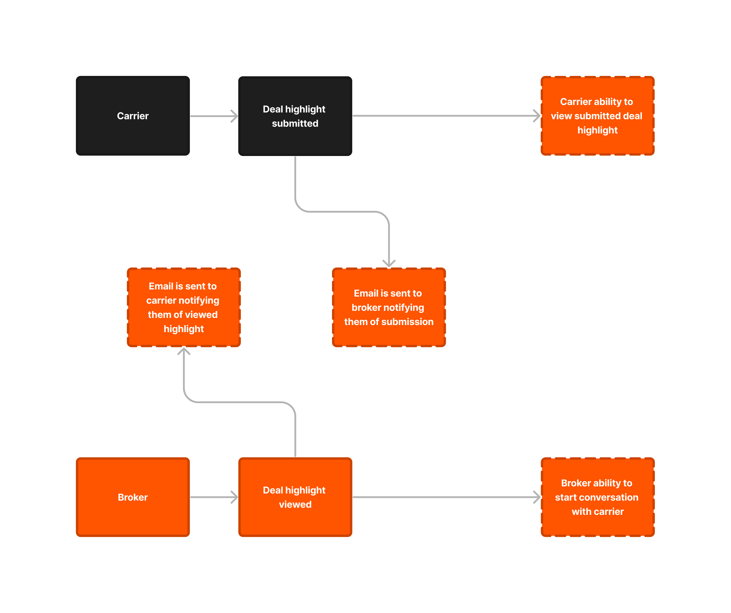
Apart from this there were also requirements tied around the feature being a
part of two of our
applications, a notification component to the feature that involved the use of
email, and
additional requirements that would ensure feature completion. These requirements
were defined at
the beginning of the project but were further refined as the design process went
on.
A Tale of Two Interfaces
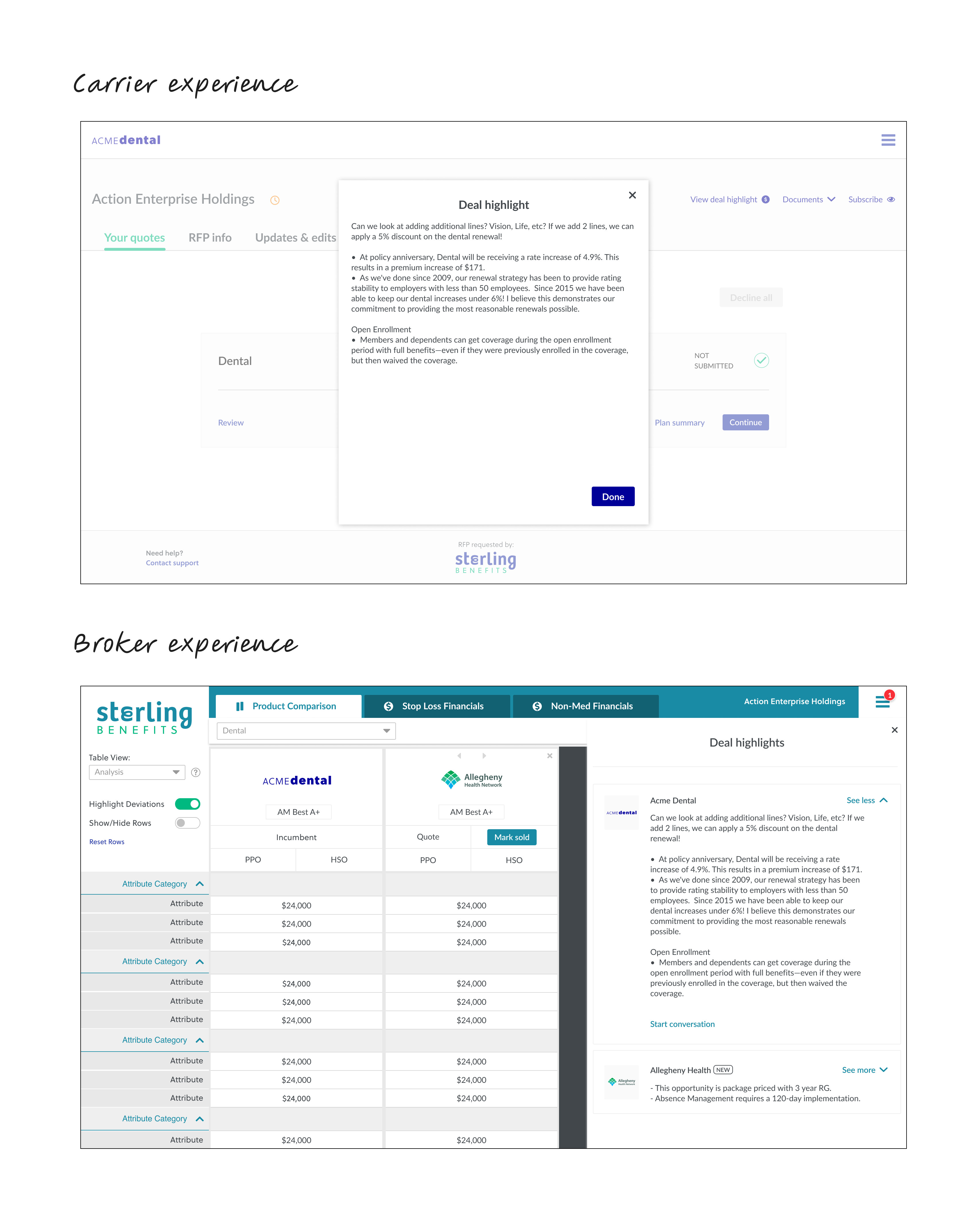
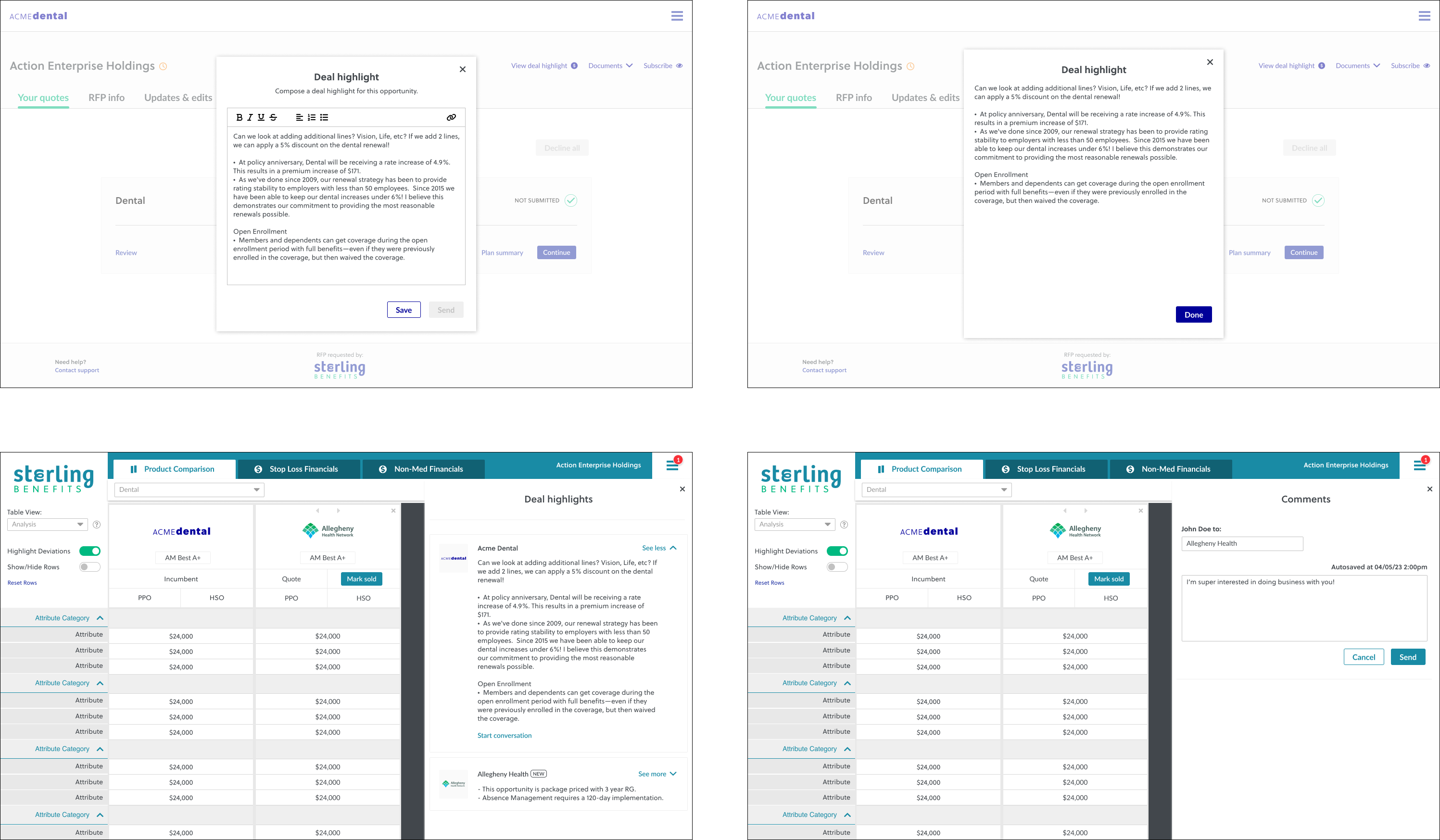
With this being a feature that touched two different applications it was both crucial and challenging developing two sets of designs. One would be for our broker platform and one for our carrier platform. The complexity continued with the testing stage as well because we had to gather feedback from two sets of users. Even though this feature had this set of intricacies it was nice getting to create something that helped such a broad user base.
Getting started
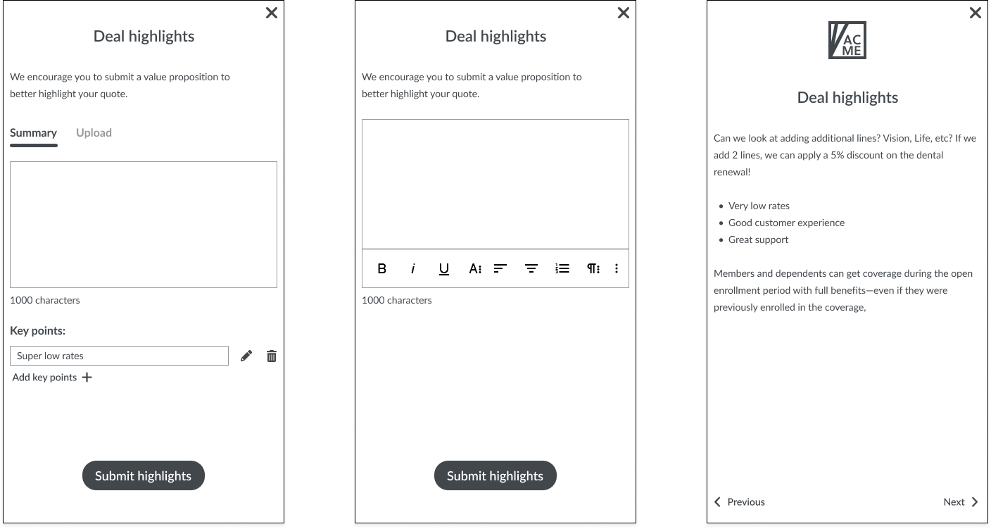
After the initial research phase was complete I was able to dive into some low-fidelity mockups. This was important because even though we had solutions defined and requirements set we didn’t have a complete vision of how the feature would look or how it would flow. I came up with a lot of different variations and presented it to the product management team so they could critique it in its early stages. The first week that I spent on designing the feature it was all in low-fidelity. I wanted to really flush out the design before I jumped into high-fidelity. Once I started putting together high-fidelity mockups the project started progressing at a faster pace. New iterations would be ready at the end of every day with a review meeting the next morning and so on. Once we got the first high-fidelity mockup to a good spot I was tasked with creating a prototype to go along with it. This was to both present the design and highlight how the feature would function live.
Initial Thoughts
Upon completing the first iteration we had a meeting with internal stakeholders from various teams. Individuals from the executive, customer experience, product, and engineering teams all took part in this first review. The feedback was mixed. Some of it was positive and some of it was positive but with proposed changes to further enhance the feature. This initial review set the stage for a truly iterative process. We had a lot of proposed changes that we had to implement after this first unveiling with less and less changes as the iterations of the design went on.
Iterations
I went through quite a few iterations on this project. This is a given with any design project especially with the amount of stakeholders involved. With every new version came additional tweaks and refinements to the design that helped drive it closer and closer to where we wanted it to be. It was crucial to garner feedback from all of these individuals, especially our customer experience team due to their in-depth knowledge of user needs.
The Future is Bright
One thing was clear with this project. It shed some new light on what we could achieve through our carrier platform. It also showed us as an organization that if we invested the time to revamp our user interface and implement additional features it would help position us for the future. Apart from that it also helped our product management team establish a timeline on how long this interface overhaul and feature add would realistically take. It was interesting that a project such as this one could help drive the direction of the company and push us to implement changes to our application that were long overdue. That alone made me realize how much of a success this project actually was and how excited it made everyone within the organization especially integral stakeholders.
Summary
I really enjoyed bringing this important feature to life. And I also enjoyed getting to see it go from an idea to a fully functioning piece of our application that is now integral for our users. It had its challenges, especially the fact that it would live on two different platforms for two sets of users but nonetheless I welcomed this challenge. Apart from this initial challenge the fact that we were chasing an MVP approach also added a level of complexity to this project. Wanting to release a minimum viable product pushes up the deadline and decreases the amount of time we have to spend in various parts of the design process. With these challenges also came opportunity. An opportunity to work across our organization with a lot of talented individuals and ultimately release a feature that is integral to our users workflows.